FINAL PROJECTSIMON AND LOUIS FIND A HOMEMy group's childrens' book is about two friends, Simon the sheep and Louis the pig who are hungry,sad and lonely. They go on a trip to find the perfect family who will be willing to take them in. Along the way,they encounter some families who are not ideal for them to feel loved and feel warmth.These families are the Browns,the Luthers,the Willards and the Jones.
In the project,my part was to draw these four families and why they are not ideal families for Simon and Louis. These pictures are shown below.

The Jones,where kids are fighting and throwing toys all over the place.Simon and Louis did not want to be in a home like that.
 The Browns,whose cows look so sad and lonely,which scared Simon and Louis.

The Luthers. The Son refuses to listen to his mother's orders of feeding the chickens.Simon and Louis knew that disrespectful children are bad and they didn't want to stay i nthis house.

The Willards,who are seen to be eating Bacon and Lamchops during a picnic lunch.This scares Simon and Louis,who obviously knew that they will be eaten if they lignered around any longer.
Apart from the above 4,i also contributed to the cover page as it was my original style and idea which the group used.
 The Eventual book cover
 My original work
8:39 AM
ASSIGNMENT 5

Color Scheme
I chose the oriental one in the end because i feel that it most portrays what i believe Asia to be in the most accurate and most colorful way.In the picture are a Chinese Pagoda,a Sikh Temple,a Mosque and a Japanese Shrine. These are 4 very different types of architecture from all across Asia.

Final Prototype
The reddish-orangey backgroudn gives a very oriental/east-asian feel to the entire postcard,even though there are also other parts of Asia such as India and Southeast Asia and even Middle East. However,i feel that the mosque and sikh temple adds enough diversity to the overall image that it makes it alright for a red-orange background to be used.

Original idea
This was my original idea. It is a concept but in photography, it doesn't translate well.The colors look flat and well the dishes are diverse,they lack an obvious difference. In the end,i decided to completely rework the entire thing.
8:07 AM
ASSIGNMENT 4
FINAL PROTOTYPE
I have chosen to do a poster entitled “DRUNK DRIVING DESTROYS LIVES” because i personally feel that it is a problem that should be dealt with more heavily. While the government has already been doing its part in its anti drunk driving movement, more can still be done.
In my poster, i show two cars crashing into each other, while alcohol glasses and containers act as a backdrop. These alcohol glasses are shaped like buildings such that they are towering over the cars.
This poster wants to communciate to the audience that the alcohol which is shown prominently, affects your ability to drive,hence resulting in a car accident symbolised by a big red zig-zag bubble.

ORIGINAL POSTER
I originally did the above poster but the feedback generally was that it was too bright or the colors were not serious enough,or too gaudy. Also, the cars were not realistic looking and the human beings do not look realistic as well. The "Drive your family for life" slogan was confusing to some.The message that i want to bring across, which is mainly that if drunk driving affects all those around you,especially your family.
In the end,i decided to change it totally and go with the above poster.
7:54 AM
ASSIGNMENT 3
 Explanation of story
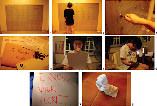
My story uses the yellow tinge on purpose, to show something secretive and dark and not so out in the open compared to if i use"whiter light". The yellowish lighting gives it a mysterious feel. Inthis storyboard,the protagonist has a letter waiting for her. She opens it and is at first shocked. She takes a second look at the envelope to see if it is a prank. It is not.Next the storyboard zooms in what the message is : "I KNOW YOUR SECRET". THe last scene leaves us with a crushed paper. We do not know if the protagonist crushed it because its all nonsense or if it is true and she's so afraid that someone knows her secret that she crushed it and threw it away. This cliffhanger ending leaves things unclear and that's my intention.
Inspiration
My story is inspired by this fantastic film entitled “The Letter”, which stars the inimitable Bette Davis. In the film, a letter discovered could potentially destroy her life and she has to do everything she can to keep her life within her control.
My story is done in such a way that aims to be slow paced and purposefully tedious. This story is not exactly like that of “The Letter” but it does borrow the aspect of a “deadly letter”. Here in my story, the protagonist receives a letter which is seemingly strange and most definitely deadly. The story ends with a cliffhanger and we do not know what happens next.
 The above image contains some original images used but were later discarded because i feel that they do not aid my story. The original letter was too long and wordy and not as impactful as "I KNOW YOUR SECRET". That is why i did not use it in the end.
ASSIGNMENT 2

Step 1: Process of Abstraction
The explanation of each step is within the picture.
I have chosen a library catalog search machine because there are so many machines i nthe library that a person gets confused when he/she needs to find the library search machine which is the most important and most often used.

This sign should be placed at all corners of the library with arrows on it as well to point towards where the machine is.
ASSIGNMENT 1
 Step 1 : Develop 4 sketches.
Here i did one sketch to show that i love playing tennis with tennis rackets manipulated into letters,tennis ball embedded into letter "E", tennis net combined to form the letter "V",etc.
Second sketch shows different microphones,and they all show that i love to sing.
Third sketch shows different types of fashion apparels and accessories to show that i am into fashion.
And lastly, the fourth sketch shows fruits because i love to eat fruits.
 2nd stage: Choose one and develop into 2 roughs.
Rough 1: I selected the one on fashion because i feel that it most represents me.
In Rough 1,i drew these clothes to be hanging on a rope for drying.
Rough 2: Here,i drew my name on what looks like fulscap paper to show the journalism
bit of my "and i aspire to become a fashion journalist".

Final Stage: Prototype.
The pencil and pen here acting as a clothes hanger are what shows the journalism(writing) aspect of the statement, and the clothes represent the fashion part of it.
CLASS EXERCISE 2
 CALM
CALM
This is an image of an open sea with the moonlight shining upon it. This to me is very calming and hence fits the word. The still night sea is peaceful in his serenity. POWER
POWER
This fist symbolises power because when i think of power i think of the phrase "iron fist". A dictator rules with an iron fist because he has power.Hence i drew an iron fist.
CLASS EXERCISE 1
 This equipment is called the "BRAINWAVE GRABBER". It grabs other people's brainwaves and activities if they are within sensory field. This means that it will also grab other people's creativity juices as well. This in turn will be transmitted into our own brains and help become more creative by having other peopl's ideas.
Not the most novel and honest thing but it works!
5:47 AM
Hello there! This is my NM2208 blog and its actually an old blog of mine that i am now reusing for this module!(i have edited the settings so that my older entries remain hidden haha) I can't wait to put up kickass graphic works in no time!(i'm not serious about this because i don't have the talent to produce such fine art)
I'll like to be very honest here,i have a studied hunch that 2208 might be my worse NM module this semester because Photoshop and Illustrator remain extremely confusing to me. I mean this spells nothing good for the future right?
Anyway,as you have guessed fairly easily already,i worship Frank Sinatra! (and also his contemporaries back in their day) I live for jazz, traditional pop music and vintage films(not retro,there's a big difference). Its strange but i have always felt like i was born in the wrong era.
Oh well,guess that's the first entry of this blog then! Until next time!
9:10 PM

 The Browns,whose cows look so sad and lonely,which scared Simon and Louis.

 The Eventual book cover
 My original work


 Explanation of story

 Step 1 : Develop 4 sketches.
 2nd stage: Choose one and develop into 2 roughs.
 CALM
CALM
